Cozy “Caffeine” Colors: 5 Paint Swatches You Need for a Fall Home Refresh
ART AND DESIGN

When the air turns crisp and your morning latte feels like a ritual, your home deserves the same warm-up. This season, say goodbye to cool grays and lean into the rich, inviting world of “caffeine colors” — hues inspired by your favorite coffee order. Think creamy neutrals, toasted browns, and deep espresso accents that bring instant comfort to every corner.
Whether you’re painting an entire room or just refreshing a nook, these five shades will turn your space into a cozy, coffee-scented sanctuary.
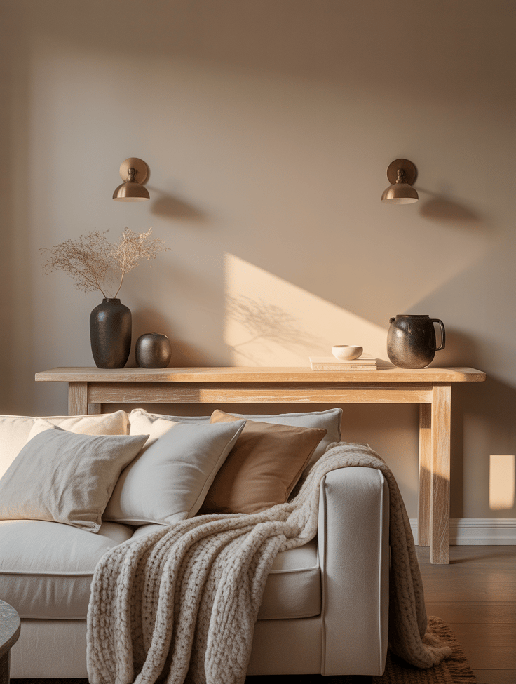
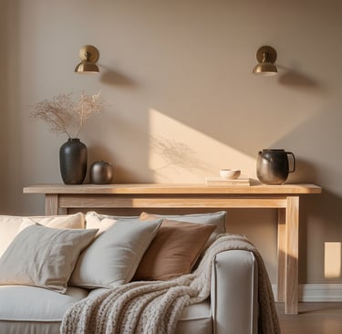
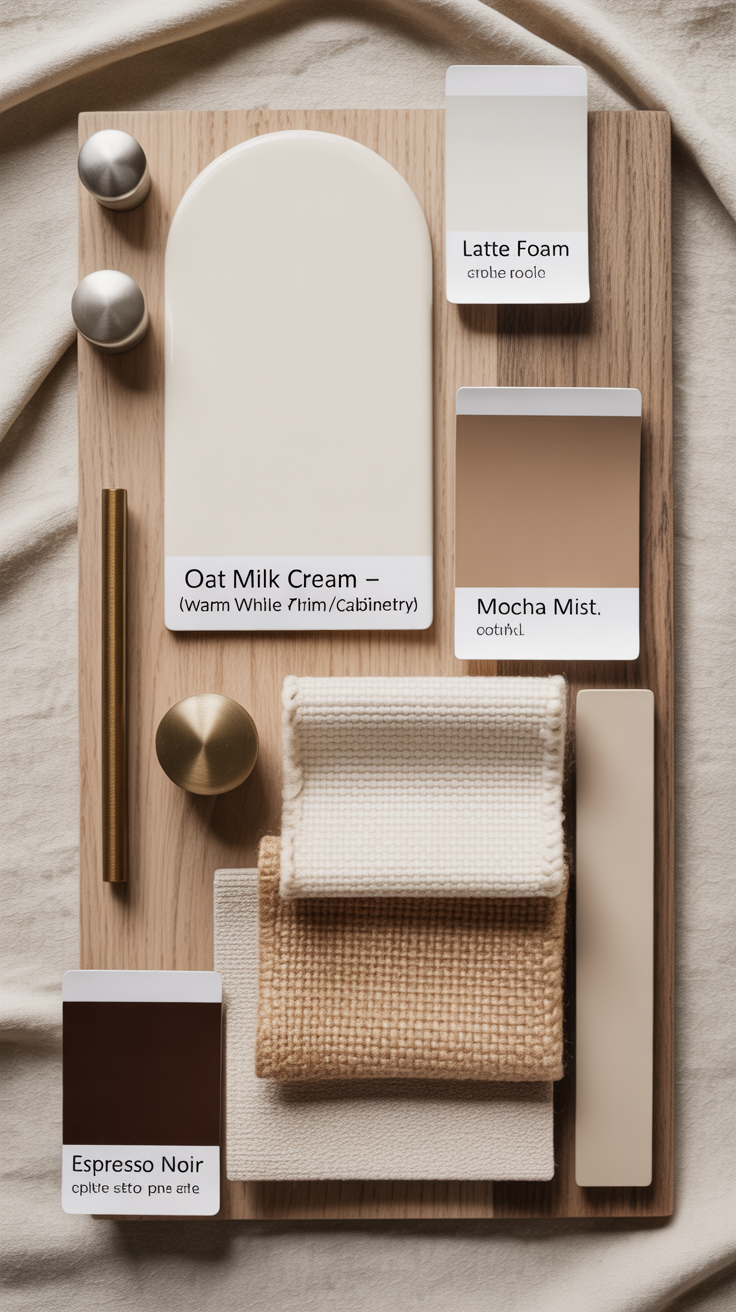
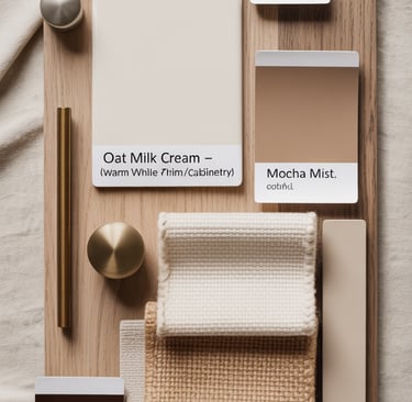
1. Latte Foam – The Soft, Everyday Neutral
Think of this shade as the visual equivalent of your first morning sip — smooth, balanced, and quietly energizing. “Latte Foam” lives in that perfect in-between space: not too beige, not too gray, just creamy enough to feel inviting while staying elevated and timeless. It’s the kind of neutral that doesn’t shout for attention but makes everything around it feel more pulled together.
Unlike stark whites that can feel cold or sterile, this warm neutral reflects light beautifully — especially in rooms that crave a little extra softness. It brings out the warmth in natural woods, enhances gold and brass accents, and complements both modern and traditional decor. The undertones lean slightly taupe with a hint of yellow, which means it plays well in almost any light — from the gentle glow of morning sun to the moody golden hour shadows.
Where it shines:
Living rooms where you want to layer textures — think boucle throws, wool rugs, and linen drapery.
Bedrooms that crave calm without crossing into boring. It’s a grounding base for cozy neutrals or muted jewel tones.
Hallways and open-concept spaces, where continuity matters. This color subtly connects zones without feeling repetitive.
Styling tip:
To keep the look intentional, mix your finishes. Pair “Latte Foam” walls with matte black or brushed brass fixtures for contrast. Add an organic rug or raw-edge wooden console to bring in tactile interest. If your room leans modern, crisp white trim will make the walls glow; if it’s more cottage or vintage-inspired, try off-white or cream trim for a seamless, soft-edged look.
Lighting matters:
Every cozy neutral depends on good lighting. If your room faces north (cool light), balance it with warm-toned bulbs or natural textures like oak and jute. South-facing rooms can handle cooler undertones or slightly deeper versions of this shade without losing warmth.
Pro designer tip:
Sample generously. Paint a large swatch (at least 50x50 cm) on different walls and watch how it changes throughout the day — that’s where you’ll fall in love with its subtle shift from morning cream to evening toast.
Shopping list:
Benjamin Moore “Natural Cream” – a perfectly balanced greige-beige that adapts beautifully to light.
Sherwin-Williams “Accessible Beige” – slightly warmer, ideal for rooms with cooler light or modern decor.
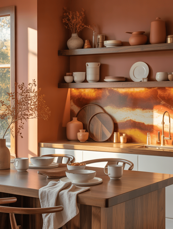
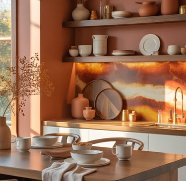
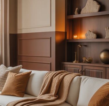
2. Cinnamon Drizzle – The Warm Accent You Didn’t Know You Needed
If Latte Foam is the calm, balanced base of your home, Cinnamon Drizzle is the soft exclamation mark — that touch of spice that makes the entire palette come alive. Inspired by the comforting warmth of freshly baked spice cake and the glow of an afternoon sunbeam, this color infuses your space with quiet energy. It’s warm, grounded, and nostalgic — like the scent of cinnamon wafting from the kitchen on a crisp October morning.
Unlike traditional “accent reds” or deep oranges, Cinnamon Drizzle walks a fine line between earthy and elegant. It’s a refined terracotta-meets-rust tone with golden undertones — vivid enough to draw the eye, yet soft enough to remain timeless. Think of it as your color version of hygge with confidence.
Why it works:
Warm cinnamon tones are psychologically comforting. They trigger associations with hearth, food, and connection — the subtle cues that make a room feel lived in and loved. They work beautifully in social areas like dining rooms, entryways, and kitchens, where you want a balance of invitation and energy.
Where to use it:
Dining nook or kitchen island: Perfect as an accent wall behind open shelving or cabinetry. The warmth pairs beautifully with white dishware, natural stone, or butcher block counters.
Entryway statement: Paint a single wall or even the inside of your front door to create an instant sense of welcome.
Living room layering: Try it behind a sofa in combination with creamy walls, to create depth without darkening the space.
Texture pairing guide:
Cinnamon tones thrive when surrounded by organic textures. Combine them with:
Raw linen or flax fabrics for balance
Brass and antique gold for shimmer
Matte ceramics or terracotta vases for an earthy contrast
Deep walnut or chestnut wood for sophistication
Lighting insight:
This hue changes personality throughout the day. In natural daylight, it radiates a sun-warmed terracotta glow; by evening, under warm bulbs, it deepens into a cozy, amber-rich tone reminiscent of candlelight. Use soft-white or amber LED bulbs (2700–3000K) to enhance the color’s natural richness.
Designer trick:
If you’re hesitant about painting a full wall, introduce Cinnamon Drizzle through architectural moments — window trim, wainscoting, or the back panels of open shelves. It adds depth and intention without commitment. You can even try it on a vintage dresser or console table for a low-effort, high-impact refresh.
Complementary palette ideas:
Latte Foam (neutral base)
Oat Milk Cream (for trim or ceiling)
Espresso Noir (for smaller decor accents like frames or cabinet handles)
Shopping list:
Farrow & Ball “Red Earth” – a sunbaked terracotta that feels cozy but sophisticated.
Behr “Cinnamon Swirl” – a balanced cinnamon tone that adds gentle warmth to any space.
3. Mocha Mist – The Effortless Warm Brown
If Cinnamon Drizzle is your cozy fall hug, Mocha Mist is the quiet confidence that follows. It’s the color equivalent of your favorite café corner — warm, grounded, and endlessly comforting without ever feeling heavy. Imagine a perfectly balanced mocha: deep enough to anchor a space, but softened by cream undertones that keep it inviting. This hue doesn’t just fill a room; it envelops it.
Mocha Mist thrives on balance — it bridges the gap between sophistication and comfort, minimalism and character. It’s ideal for anyone who loves a rich palette but doesn’t want the drama of charcoal or espresso walls. The subtle gray-beige undertones make it versatile, adapting beautifully to both natural light and artificial warmth.
Why it works
Brown is making a comeback — but not the muddy 2000s version. Today’s browns are modern, moody neutrals that add visual depth without stealing focus. Mocha Mist works because it has a soft, enveloping quality that instantly makes a space feel more curated and cozy. It flatters everything around it: brass, stone, greenery, or even soft blush tones.
It’s a color that grounds a home — like the base note in a perfume, subtle but essential. It brings balance to white ceilings, warmth to modern materials, and texture to minimalist designs.
Where to use it
Living rooms and dens: Use it on the lower half of the wall (like modern wainscoting) for a rich, cozy contrast with cream upper walls. Add plush throws and soft lighting to create an indulgent, layered feel.
Bedrooms: Perfect for a cocooning effect. Paint all four walls or just behind the bed to create an intimate, warm retreat.
Entryways: Creates a strong first impression — grounded, stylish, and welcoming. Especially beautiful paired with stone or tile flooring.
Office or reading corner: Adds focus and calm. Pair with linen drapery, a caramel leather chair, and a small brass desk lamp for balance.
Styling tips
Mocha Mist loves contrast. To prevent it from feeling too traditional, mix materials:
Light linen or cotton upholstery for airiness
Vintage brass or bronze for subtle shine
Textured ceramics, marble trays, or stone decor for tactile variation
A statement piece in black or charcoal for a modern touch
Play with matte and gloss finishes — matte walls paired with a glossy side table or metallic vase create that “designed, not decorated” look.
Lighting matters
This color shifts beautifully with light.
In north-facing rooms, add warm bulbs (2700K–3000K) to enhance the creamy warmth of the brown.
In south-facing rooms, natural light brings out the taupe undertones, keeping the space calm and airy.
If you want to amplify the cozy factor, pair it with warm metal lighting (antique brass, aged gold) and amber glass. The reflections will deepen the mocha tone, creating that golden-hour effect — all day long.
Designer’s pairing palette
Base: Mocha Mist walls
Trim: Oat Milk Cream or Latte Foam for warmth
Accent: Espresso Noir on furniture or frames
Metallics: Brushed brass or burnished copper
Textiles: Wool, boucle, or cotton blends in cream, caramel, or deep rust
Pro Tip
If you’re afraid of dark paint, start small — try it in a hallway, bathroom, or reading nook. Paired with soft lighting and natural textures, Mocha Mist won’t make the space feel smaller; it’ll make it feel intentional, like a boutique hotel corner designed for calm.
Shopping list
Sherwin-Williams “Kaffee” – a deep, elegant brown with gray undertones for a timeless look.
Benjamin Moore “Toffee Cream” – softer and milkier, perfect for smaller spaces or pairing with lighter neutrals.
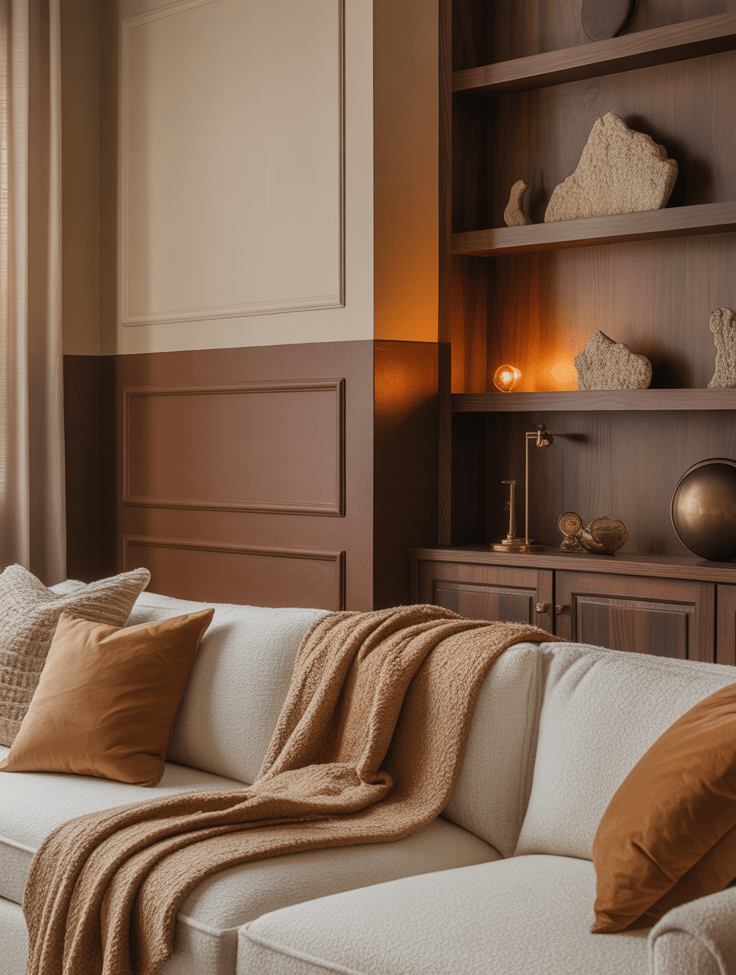
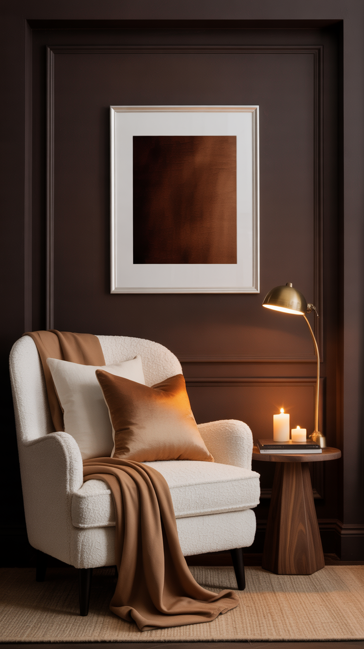
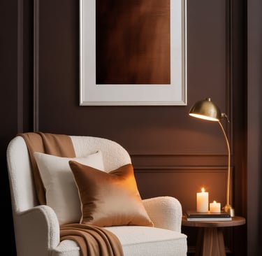
4. Espresso Noir – The Bold Comfort Zone
If every cozy home needs a little drama, Espresso Noir is how you do it — elegantly, intentionally, and without regret. This is the color that transforms “comfortable” into “captivating.” Deep, velvety, and sophisticated, it’s inspired by the richness of a double espresso — full-bodied, intense, yet smooth enough to sip slowly.
Espresso Noir is the unsung hero of moody interiors. Where lighter neutrals create calm, this tone creates presence. It’s not just a wall color; it’s a backdrop for story and soul. It anchors a space, adds visual weight, and makes everything else — wood, brass, linen, even candlelight — glow against its dark embrace.
Why it works
Dark colors have a reputation for being “too much,” but Espresso Noir proves otherwise. The key is its warm undertone — a hint of deep brown mixed with black and a trace of mahogany — which keeps it from feeling cold or flat. It’s sophisticated but never severe. Unlike charcoal or pure black, this shade reflects just enough light to maintain texture and depth.
Psychologically, darker tones create a sense of security and grounding. When used thoughtfully, Espresso Noir makes a room feel enveloping, not oppressive. It’s the color equivalent of sinking into a velvet armchair by candlelight — intimate, calming, and a little luxurious.
Where to use it
Bedrooms: Paint all four walls for a cocoon-like sanctuary, or use it just behind the headboard for a hotel-level upgrade. It pairs beautifully with crisp white bedding, brass sconces, and rich wood tones.
Reading corners: Perfect for alcoves or window nooks — it draws focus and makes small spaces feel intentional rather than forgotten.
Dining rooms or home offices: Creates atmosphere and depth, especially when layered with warm lighting and tactile materials.
Trim, doors, or cabinetry: For the color-shy, try Espresso Noir on woodwork or built-ins. It adds contrast and polish without overwhelming the room.
Styling tips
Balance is everything with this color. Use contrast to keep the look alive:
Light + dark pairing: Combine with off-whites, caramels, or oat creams to soften the depth.
Texture play: Boucle or linen upholstery against a dark wall adds a subtle sensory dimension.
Metal accents: Brass, antique gold, or bronze light fixtures shimmer beautifully against the espresso base.
Art and mirrors: White mats and light frames pop dramatically, turning your wall into an art gallery.
Add ambient lighting wherever possible — wall sconces, table lamps, or hidden LED strips. The way warm light hits this shade is mesmerizing; it turns from rich brown by day to sultry espresso-black by night.
Lighting insights
In north-facing rooms, pair with warm lighting (2700K) and natural materials to avoid a flat appearance.
In south-facing rooms, natural light brings out the brown undertone, making it feel cozy rather than shadowy.
Candlelight or dimmable bulbs make this color sing — think of it as an atmosphere, not just a color.
Designer’s pairing palette
Primary: Espresso Noir (walls, trim, or cabinetry)
Complimentary neutrals: Oat Milk Cream, Latte Foam
Accent metals: Brass, antique bronze, aged copper
Textiles: Ivory boucle, tan leather, stonewashed linen, dark walnut woods
Mood pop: Dusty mauve or deep olive green for art or textiles
How to make it livable
The trick with deep tones like Espresso Noir is layering light and texture. Add:
Multiple sources of warm light — floor lamp + candle + wall sconce
Contrasting materials like rattan or stone
Reflective touches (a gold mirror, a glass vase) to bounce light subtly around the room
If your space is small, don’t fear it — embrace it. Dark walls actually blur edges visually, making the room feel infinite rather than cramped.
Pro Tip
When painting, choose an eggshell or matte finish — it enhances the velvety richness of the color. High gloss can reflect too much light and lose the cozy depth that makes Espresso Noir so irresistible.
Shopping list
Benjamin Moore “Espresso Bean” – a warm, dark brown-black that feels plush and dimensional.
Behr “Black Mocha” – slightly cooler and more modern, ideal for bold cabinetry or trim.
5. Oat Milk Cream – The Modern Minimalist’s Warm White
Meet Oat Milk Cream — the quiet hero of any cozy home. It’s the kind of white that doesn’t feel cold or clinical, but rather soft, lived-in, and beautifully imperfect. Think of the gentle froth at the top of your morning oat milk latte: creamy, airy, and warm without a hint of yellow. It’s the color of calm mornings, folded linen sheets, and sunlight filtering through gauzy curtains.
This isn’t your builder-grade white — it’s a designer’s neutral. Oat Milk Cream strikes the perfect balance between fresh and familiar, between minimalist and welcoming. It’s white with a story — subtle enough to act as a backdrop for bolder tones, yet warm enough to hold a room on its own.
Why it works
True whites often skew too blue, especially in real-life lighting. Oat Milk Cream has a barely-there undertone of beige and blush that reflects light softly, making spaces feel open but not empty. It flatters every other “caffeine” shade — from Latte Foam’s creamy beige to Espresso Noir’s deep richness — and brings cohesion to a palette built on comfort and warmth.
Psychologically, this shade signals freshness and clarity — but with heart. It feels modern and mindful, not sterile or trendy. It’s the paint color equivalent of clean sheets after a long week — instantly uplifting, but grounding in its simplicity.
Where to use it
Open-concept spaces: Perfect as a base for rooms that need flow. It visually connects areas without making them feel flat.
Bedrooms: Use it for walls, trim, and ceiling for an ethereal, cloudlike effect — pair with natural wood and soft textiles for balance.
Kitchens: Beautiful for cabinetry, especially when paired with brass hardware or a warm marble backsplash.
Bathrooms: Makes small spaces feel spacious and light-filled — the warm undertones prevent that harsh “glare” effect.
Art and gallery walls: The ideal backdrop for prints, photography, and framed neutrals — lets every piece breathe.
Styling tips
Oat Milk Cream thrives in rooms that blend minimalism with coziness. To bring out its warmth and depth, layer textures and finishes rather than color contrast.
Pair with natural materials like rattan, linen, wool, and oak.
Add warm metallics — brushed brass, champagne gold, or even antique silver for a soft glow.
Introduce tactile details like woven baskets, ceramic lamps, or boucle cushions.
For art, choose muted tones like soft clay, taupe, or olive green for a serene vibe.
For a subtle monochrome look, combine different shades of cream and ivory throughout — from curtains to bedding to candles — letting shadow and texture do the visual work.
Lighting insight
Lighting transforms this color from morning to night:
In natural daylight, it appears creamy and airy.
Under warm bulbs (2700–3000K), it takes on a cozy, candlelit warmth that feels instantly relaxing.
Avoid cool LED lighting — it flattens the tone and cancels out the softness that makes this shade special.
To emphasize the “oat milk” glow, consider matte finishes for walls and satin finishes for trim. Matte reflects less light, giving the space that modern, diffused glow associated with cozy editorial interiors.
Designer’s pairing palette
Base: Oat Milk Cream (walls, trim, or cabinetry)
Accent: Latte Foam or Mocha Mist for subtle depth
Contrast: Espresso Noir for hardware or small furniture pieces
Textiles: Linen, wool, boucle, or cotton in tones of ivory, sand, and pale blush
Metals: Brushed brass or champagne gold
Pro Tip
To keep your warm white looking intentional — not “off” — test it alongside your flooring and fabrics. Natural woods, stone, and textiles all influence undertones. Paint large swatches directly on walls and observe them in morning and evening light. Oat Milk Cream should always feel soft and seamless, never yellow or gray.
If you’re creating content or styling photos, this color photographs beautifully — the camera reads it as natural daylight rather than stark white, giving images that coveted “warm minimalism” aesthetic seen in interior magazines.
Shopping list
Farrow & Ball “Pointing” – a soft white with gentle warmth that pairs beautifully with neutrals and wood tones.
Sherwin-Williams “Alabaster” – creamy, luminous, and universally flattering across styles and light levels.
The Final Sip
Just like your favorite coffee order, your home’s color palette should feel personal, comforting, and a little indulgent. Whether you lean toward the creamy calm of Latte Foam, the spiced warmth of Cinnamon Drizzle, or the moody sophistication of Espresso Noir, each shade tells a quiet story — one of warmth, character, and intention.
A fall refresh doesn’t have to mean a full renovation. Sometimes, all it takes is a new color on the wall to change how a space feels. So grab your paint samples, light your favorite candle, and let your walls reflect your season of cozy.
Because home, like coffee, should always be made just the way you like it.
Ready to Start Your Cozy Refresh?
Pin your favorite shades from the Cozy Caffeine Colors series to your Fall Home Inspiration board — or save the full collection for your next weekend project.
Follow The Cozy Edit on Pinterest for more color stories, small-space styling tips, and cozy-maximalist home ideas that bring warmth (and a little fancy) to everyday living.