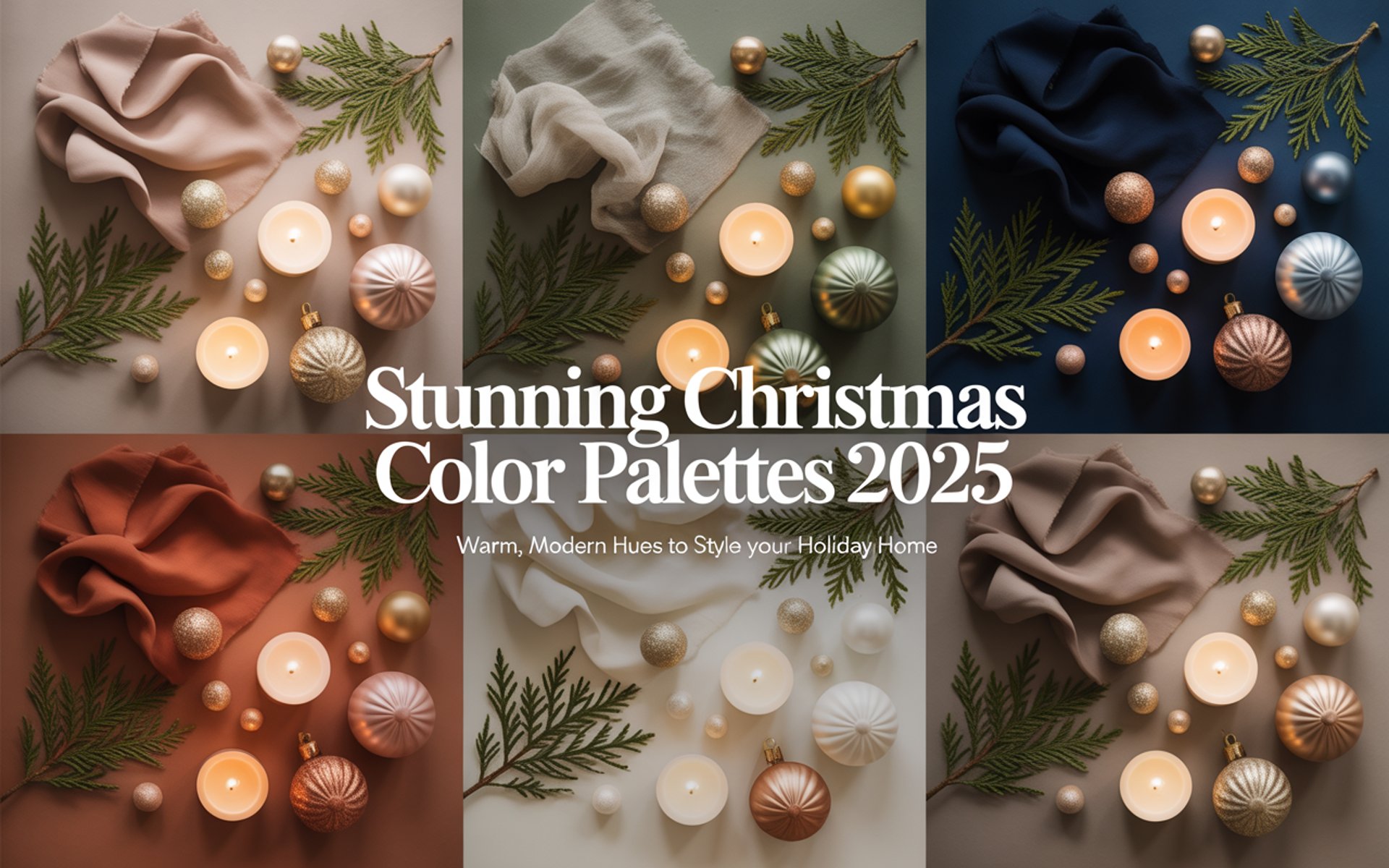
Creating Cozy Vibes: 5 Stunning Christmas Color Palettes for 2025
ART AND DESIGN
There’s something magical about how color alone can shift the energy of a space. A hint of blush, a touch of pine, or a flicker of gold can change your living room from “everyday cozy” to “holiday movie moment.”
For Christmas 2025, the most beautiful homes won’t rely on excess — they’ll embrace color stories that feel lived-in, layered, and quietly luxurious. Whether you’re a minimalist, a traditionalist, or somewhere in between, these five palettes will help you design a space that’s warm, inviting, and deeply personal.
1. Sugar Plum Glow
Palette: Mauve · Dusty Rose · Champagne · Soft Gold · Cream
A soft romantic palette that whispers luxury. Perfect for anyone who craves a break from traditional red and green — “Sugar Plum Glow” balances warmth and sophistication with just enough shimmer to feel festive.
How to Style It:
Start with neutrals. Keep your base creamy and light — ivory throws, soft beige walls, or a pale linen tablecloth.
Add the glow. Use rose-tinted glass ornaments, satin ribbons, and metallic accents (like champagne or pale gold) to catch the light.
Play with light sources. Fairy lights, mercury votives, and candles in clusters will create that dreamy reflection effect that defines this palette.
Bonus tip: Choose faux fur textures in blush or ivory to add a tactile layer that feels indulgent but grounded.
Shop the Look:


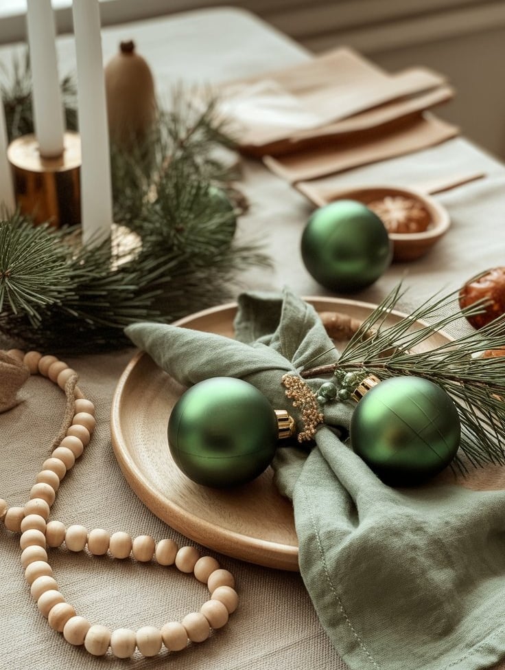
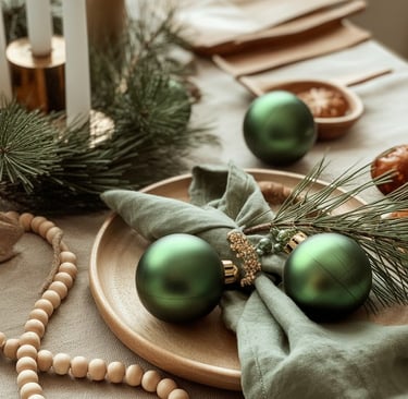
2. Nordic Evergreen
Palette: Forest Green · Sage · Linen · Wood · Warm White
Calm, natural, and effortlessly elegant — “Nordic Evergreen” captures the essence of Scandinavian design: minimal, meaningful, and full of natural texture.
How to Style It:
Anchor with nature. Let greenery take center stage: cedar garlands, pine branches, or olive wreaths. Keep them slightly imperfect — asymmetry feels organic.
Mix soft and rough. Balance smooth ceramics and matte candles with wood and knitted elements. The contrast adds depth.
Stay light. Too much green can feel heavy. Offset it with creamy whites and touches of warm beige to maintain that Nordic airiness.
Bonus tip: Layer cozy lighting. Use warm-toned bulbs and candlelight instead of cool LEDs to preserve the softness.
Shop the Look:
3. Midnight & Moonlight
Palette: Navy · Pewter · Silver · Ice Blue · Ivory
For those who love sleek, modern spaces but still crave that wintry charm. “Midnight & Moonlight” is calm, clean, and quietly glamorous — a palette that works especially well in smaller homes or apartments where dark tones can add visual drama without clutter.
How to Style It:
Go for contrast. Use navy as your grounding color (a throw blanket, rug, or accent wall) and balance it with icy blue or silver highlights.
Add texture instead of clutter. Velvet cushions, ribbed glass ornaments, and frosted finishes will make the palette come alive without adding “stuff.”
Reflect the light. Silver mirrors or metallic candle holders help bounce glow around the room, softening the darker hues.
Bonus tip: For a subtle nod to tradition, weave in one or two champagne accents — it instantly warms the palette without losing the modern edge.
Shop the Look:


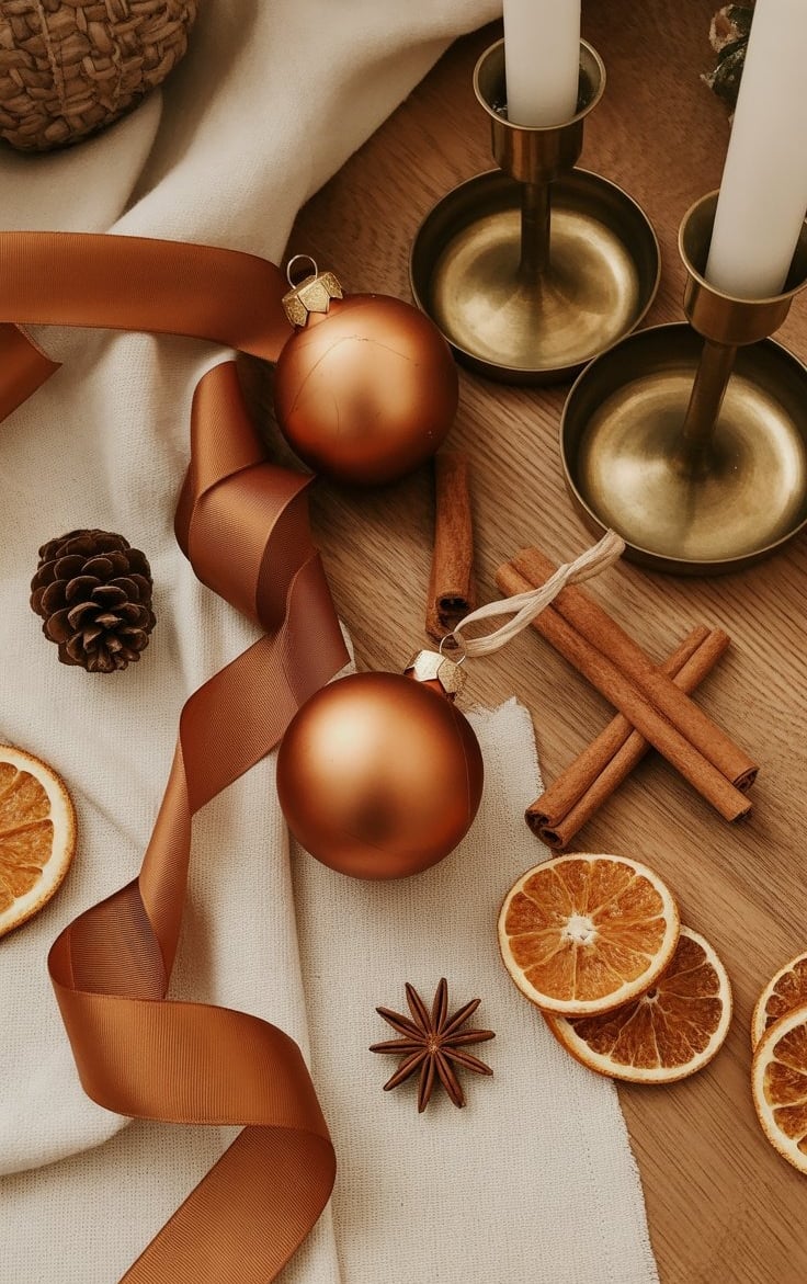
4. Cinnamon & Cream
Palette: Terracotta · Caramel · Cream · Rust · Olive
Warm, grounded, and nostalgic — this palette feels like mulled wine by a crackling fire. It’s perfect for rustic, farmhouse, or bohemian interiors that thrive on earthy tones and handmade textures.
How to Style It:
Work in layers. Start with neutrals like cream or beige, then build warmth with terracotta vases, caramel throws, and rust-toned ribbons.
Mix materials. Combine ceramics, linen, and unfinished wood for a textural look that feels cozy and authentic.
Bring the scent of the season. Dried oranges, cinnamon sticks, and clove pomanders double as natural décor and smell incredible.
Bonus tip: Use vintage brass or copper accents — their warm patina pairs beautifully with this color story.
Shop the Look:

5. Frosted Neutrals
Palette: Taupe · Soft White · Champagne · Pale Grey · Gold
This is the color palette for serene spaces — spa-like, bright, and effortlessly refined. “Frosted Neutrals” is ideal for open-concept homes or small apartments where you want a cohesive flow between rooms.
How to Style It:
Focus on tone-on-tone layering. Keep your colors in the same family — soft whites, creams, and warm greys. The magic lies in texture, not contrast.
Add shimmer sparingly. Champagne ornaments, gold-tinted glassware, or a subtle metallic ribbon can bring depth without overpowering the calm.
Introduce softness. Think boucle throws, frosted glass votives, and plush rugs — tactile comfort creates that “luxury retreat” feeling.
Bonus tip: If you crave contrast, add a single grounding element (like a dark wood table or black candle holder) to keep the look sophisticated.
Shop the Look:


How to Choose Your Perfect Palette
Choosing your color story is about more than what’s “trending.” It’s about how you want your home to feel this winter.
Ask yourself:
Do I want my home to feel calm and bright → choose Frosted Neutrals or Nordic Evergreen.
Do I want cozy romance → Sugar Plum Glow is your match.
Do I want modern sophistication → Midnight & Moonlight.
Do I want earthy warmth → go for Cinnamon & Cream.
Once you find your anchor palette, bring it to life through three key elements:
Textures (linen, velvet, wool, glass)
Lighting (soft, warm, layered)
Small accents (ribbons, ornaments, florals)